Market Commentary October, 2020
October Update – The Hurricane Two-Step
It’s nice to live on the Gulf Coast.
However, as with most things, there are tradeoffs. As I stare out my window on a sunny, warm autumn day, I see debris in my back yard and a gap where an 80’ tall tree stood before a hurricane ripped through our little town. Thankfully, no one was hurt, though the damage was immense.
This being our first hurricane. Though we were prepared, we certainly underestimated the severity (as did the experts at NOAA). Moreover, one thing missing was the cliched “calm before the storm”; you could feel the storm as it approached. As we sit here today, another storm is spinning toward the gulf coast.
The markets have been hit by one hurricane already this year, i.e., the COVID-induced bear market of February/March. As with the hurricane that hit us, it happened quickly, though the damage, at least in terms of the S&P 500, was quickly repaired. However, not too far on the horizon, conditions are ripe for another storm in the markets, with what is sure to be a rollicking U.S. presidential election a little less than one month from now.
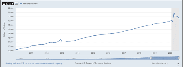
Before this week, we probably would have all joked that the one thing on which both parties agree is spending money. However, with President Trump’s tweet regarding exiting negotiations on a stimulus bill, markets reacted swiftly (and negatively).
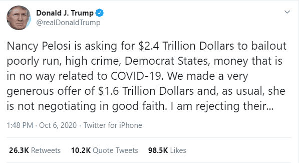
The knee-jerk reaction made sense. Personal incomes have been goosed by massive fiscal stimulus since March, pushing them well above where they were pre-COVID, per data from the St. Louis Fed (Graph One). As we see, the effect is beginning to wane and, in the absence of new stimulus, incomes could decline sharply as the job market is still recovering.
Graph One
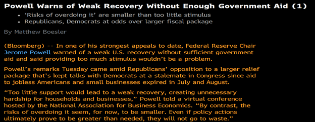
The Federal Reserve’s preference for fiscal policy to take the baton from monetary policy has been made abundantly clear via various speeches from Fed governors and chair Powell.
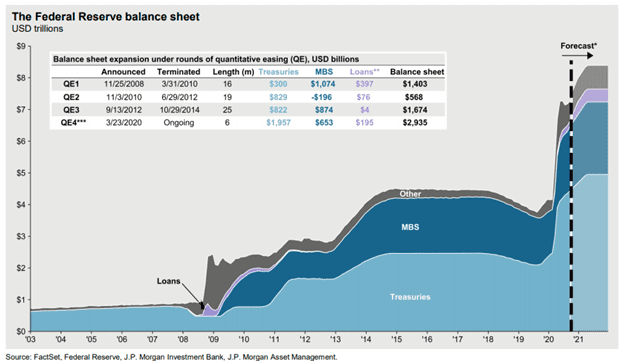
The reason? The Fed has already massively expanded its balance sheet (Graph Two), lowered the Fed Funds rate to almost zero, and stated its intention to drive inflation higher. Moreover, the U.S. fiscal response to COVID, while a hefty 15% of GDP, is well below, in percentage terms, what Germany, Italy, Japan, the U.K., and France have spent.
With so much happening, it is easy to lose sight of the fact that we just closed the books on a strong third quarter that saw the S&P 500 and NASDAQ hit new highs. Smaller caps and non-U.S. companies did not fare as well, i.e., diversification was not generally helpful. Fixed income finally took a breather, though year-to-date bonds have outperformed pretty much everything expect large cap technology stocks.
Table One
| Index | 1-Month | 3-Month | YTD | 1-Year |
| S&P 500 Index | -3.80 | 8.93 | 5.57 | 15.14 |
| NASDAQ Composite Index | -5.11 | 11.23 | 25.40 | 41.06 |
| Russell 2000 Index | -3.34 | 4.93 | -8.70 | 0.37 |
| MSCI EAFE Index | -2.59 | 4.88 | -6.69 | 0.99 |
| MSCI Emerging Markets Index | -1.62 | 9.65 | -0.96 | 10.84 |
| Bloomberg Barclays US Agg | -0.05 | 0.62 | 6.79 | 6.98 |
| Bloomberg Barclays US Treasury | 0.14 | 0.17 | 8.90 | 8.04 |
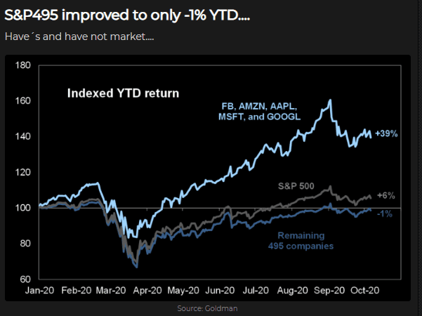
While the S&P 500 is up almost 6% this year, it is worth noting a handful of megacap, technology-oriented names have contributed their share and more, and that the remaining 495 stocks in the S&P 500 are pretty much flat for the year (Graph Three):
Graph Three
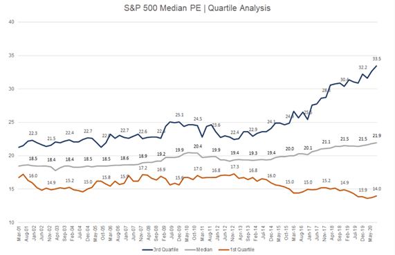
The stock market’s resurgent performance after the initial shock of COVID has pushed the S&P 500 to valuation levels last seen during the height of the technology bubble, with its current forward price/earnings multiple around 22x. This compares to 24x at the peak of the technology bubble and a long-term average of around 16x. One enormous difference that makes a simplistic statement that the market is “expensive” is adjusting for the current level of interest rates versus their historically higher levels. Interestingly, and representative of any number of things about the nature of the recovery as well as society, is that the valuations have bifurcated, with richly valued, high-growth stocks (3rd quartile, blue line) becoming even more so while cheap stocks (1st quartile, orange line) have become even cheaper (Graph Four).
Graph Four
Since it’s election season, we refer you to this classic SNL bit and are going to describe how low rates work in mathematical terms and why stocks with higher growth are more richly valued. We will look at two fictional companies: the Leftorium, a slow growth, mall-based retailer, and Flancrest Enterprises, which sells books over the internet.


The Leftorium generates $5 in cash and grows it 5% per year for ten years. At a 10% discount rate (the interest rate we use to determine valuation), the stock is worth around $37 (the sum of the present values of expected future cash flows).

If we lower the discount rate to 1% due to the Fed lowering rates, the stock is worth $59, or 59% more than when rates were “normal”. Its P/E multiple goes from 7x ($37 price divided by $5 in earnings) to 12x ($59 price divided by $5 in earnings).
But that business is boring.
Let’s look at something more exciting; Flancrest. It generates $1.7 in cash flow to start but is growing much more quickly (30% per year). At a 10% discount rate, it is worth $37, the same as the Leftorium. However, if we reduce rates to 1%, its value goes to $67, higher than the Leftorium, and its P/E multiple goes from a modest 22x to 39x.

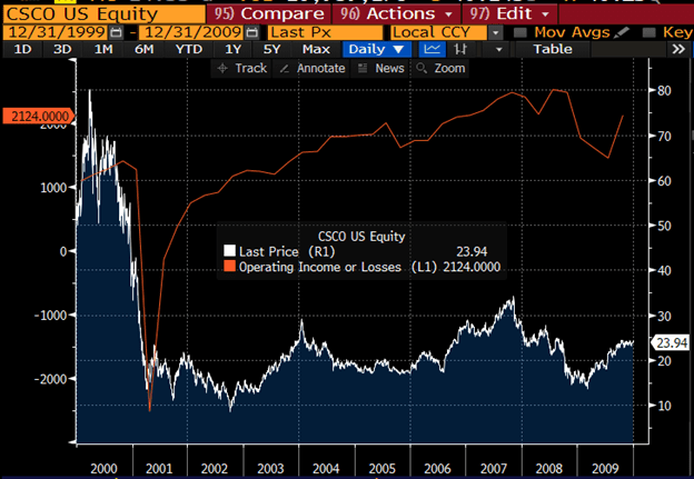
The point is, as rates decline, multiples massively expand for names with the potential for strong future growth. Whether this growth is achieved does not matter in the near-term, but over time the market will punish names that fail to achieve the lofty expectations built into the price. One need look no further than former top five S&P member Cisco to see how market sentiment can change despite, in its case, more than doubling its income over the next ten years (Graph Five). In other words, multiple expansion can be fleeting.
Graph Five
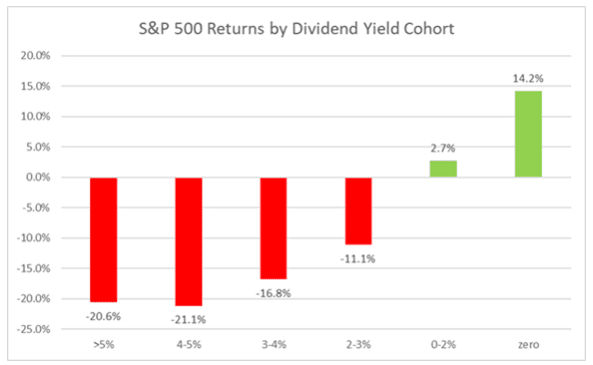
The market is currently not ascribing any benefit to cash in your pocket as discount rates approach the zero bound. We have seen that this year in terms of stock price performance; look no further than Graph Six for the staggering difference in returns between dividend payers, which put cash in your pocket today, and non-payers.
Graph Six
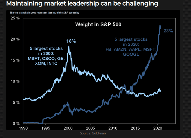
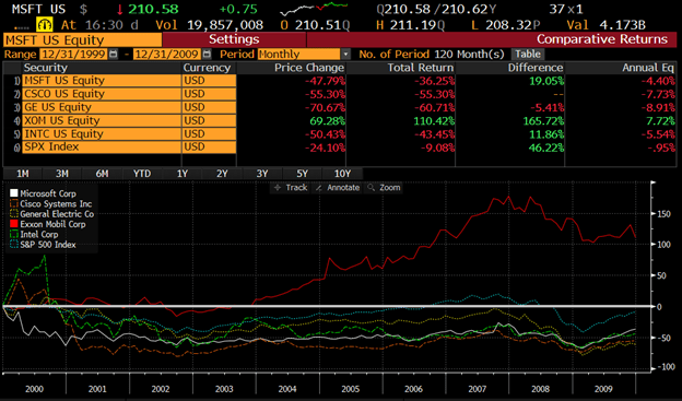
As with all things, be they market cycles, elections, or hurricanes, this, too, shall pass. Were we to jump back to the year 2000, here is what the top five looked like (Graph Seven) and how they performed over the next 10 years (Graph Eight). Exxon (remember it?) was the only outperformer. Then Microsoft took the lead, and is now the only one of the top five names beating the index, not to mention the only one still in the top five.
Graph Seven
Graph Eight
We will conclude by reminding everyone returns come from one of three places: income (interest or dividends), growth, and multiple expansion. Let’s look at each in turn:
- Income
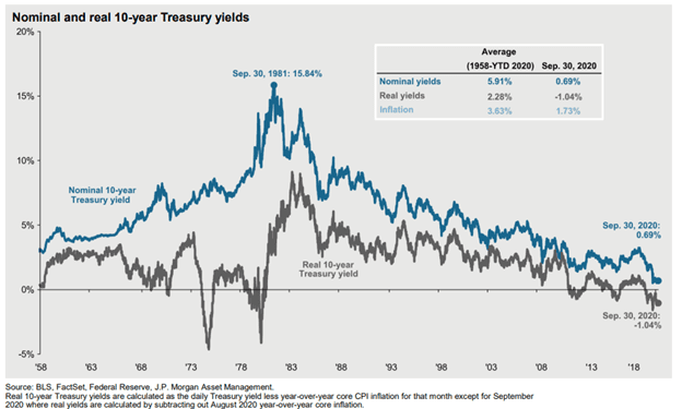
- Bonds – Yields at all-time lows; 10-year Treasury at 0.7% (Graph Nine) and the Barclays Aggregate at 1.2%.
Graph Nine
- Equities – Dividend yield for the S&P 500 Index of 1.7% is better than bonds but low versus history.
- Growth
- Bonds – None
- Equities
- Over the last 20 years, we have averaged around 7% earnings growth, with around 4% from margin expansion and 3% from revenue growth.
- Multiple expansion
- Bonds –There is not much juice left to squeeze with rates so close to 0%.
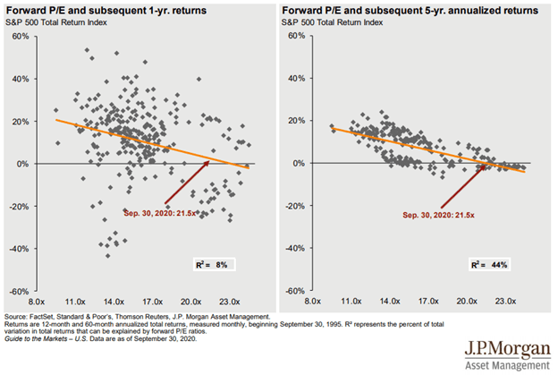
- Equities – As discussed, the low discount rate warrants a higher valuation. However, based on history, we would not expect much expansion from these levels (Graph Ten):
Graph Ten
-
- The capital appreciation in the following (Graph Eleven) comes from growth (let’s say that’s around 7%) and multiple expansion.
- Recently, we have had more than our fair share of multiple expansion as rates have declined, though this is likely a one-time re-rating.
Graph Eleven

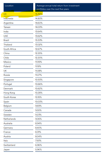
- Despite high multiples, Americans expect returns well above the long- term averages over the next five years, and are more ambitious than any other country:
- So, what can we learn from hurricanes, be they market or real?
-
-
- They do not always hit. Even though market prognosticators and indicators like VIX, which is like a barometer for the market, show the coming months may be stormy, their record is about as accurate as that of a meteorologist.
- Regardless, it’s good to be prepared. Own some things that will protect you in case things get dicey. That’s how we construct your portfolio.
- Do not follow the crowd. When everyone decides to leave at the same time, it is a problem. This holds true for hurricane evacuation routes as well as crowded investments. For the latter, the most crowded spaces now are technology and passive index funds.
-
READY TO TALK?
