

April Update: Waterloo
Key Takeaways
- Not even a banking panic could keep the S&P 500 from posting gains for March and Q1.
- Renewed hopes for a Fed pivot sent investors flocking to the perceived safety of megacap tech stocks, with the NASDAQ triumphantly entering an official bull market.
- However, just as Napoleon’s return from exile was short-lived, we believe the euphoria of a new bull market will be fleeting, though opportunities will be found in less conventional parts of the market.
“History is a set of lies agreed upon.” Napoleon Bonaparte
“The history book on the shelf, is always repeating itself.” ABBA
“All the business of war, and indeed all the business of life, is to endeavor to find out what you don’t know by what you do; that’s what I called ‘guessing what was at the other side of the hill.” The Duke of Wellington
Waterloo. A great battle and an even better song, it will be the inspiration for our Q1 recap and outlook.
I am certain many of our readers are students of history. However, most Americans are not, and – when asked about Napoleon – would probably respond with one of the following:
- He was short.
- He lost at Waterloo and then was exiled to Elba.
Both are wrong. At approximately 5’5”, he was around average height for the time. Measurement confusion, English propaganda, and recency bias have relegated him to the stereotypical “short man”. And, although both parts of statement two are true, the order is incorrect. Napoleon was defeated after his disastrous Russia campaign and exiled to Elba, which proved too close to France (red pin in the below map). He returned to Paris, seized power, and was then defeated at Waterloo. Having learned a lesson, he was exiled much farther this time, to Saint Helena in the middle of the Atlantic (white dot).

Why does this matter? Sometimes, the punishment does not go far enough.
March Recap – History is a set of lies agreed upon.
When we look back at the history of Q1 2023, as well as March, it will be easy to think that it was a good time to own stocks:
| Index | 1-Month | YTD | 1-Year |
| S&P 500 INDEX | 3.67 | 7.48 | -7.75 |
| NASDAQ Composite Index | 6.78 | 17.05 | -13.25 |
| Russell 2000 Index | -4.78 | 2.73 | -11.63 |
| MSCI EAFE Index | 2.61 | 8.65 | -0.79 |
| MSCI Emerging Markets Index | 3.04 | 3.97 | -10.39 |
| Bloomberg US Treasury Total Re | 2.89 | 3.00 | -4.51 |
| Bloomberg US Agg Total Return | 2.54 | 2.96 | -4.78 |
| Invesco DB Commodity Index Tra | -0.08 | -3.69 | -8.35 |
Source: Bloomberg (as of most recent month end)
However, we would be agreeing on a set of lies if we take that statement at face value. Here is what the numbers look like if you compare the ten largest index holdings versus the rest:
| S&P Stock Returns | 1-Month | YTD |
| Top Ten – Average | 11.00 | 34.02 |
| S&P 500 Average | (0.26) | 3.83 |
These top ten stocks are not cheap, trading at a 53% premium to the S&P 500 on a forward earnings basis and an 181% premium on price to sales. Could they grow into these multiples? Sure, though at these prices, a euphoric future is envisioned for many of these companies:
| Company | Forward P/E Ratio | Premium/Discount to S&P 500 Multiple | Forward P/S Ratio | Premium/Discount to S&P 500 Multiple |
| Apple Inc | 26.8 | 42% | 6.6 | 186% |
| Microsoft Corp | 29.1 | 54% | 9.8 | 323% |
| Amazon.com Inc | 38.8 | 106% | 1.9 | -18% |
| NVIDIA Corp | 61.8 | 228% | 22.9 | 889% |
| Alphabet Inc | 18.6 | -1% | 5.1 | 120% |
| Berkshire Hathaway Inc | 17.4 | -8% | 2.0 | -13% |
| Tesla Inc | 48.0 | 155% | 5.9 | 155% |
| Alphabet Inc | 18.7 | -1% | 5.1 | 120% |
| Exxon Mobil Corp | 11.6 | -38% | 1.3 | -43 |
| Meta Platforms Inc | 17.1 | -10% | 4.5 | 96% |
| S&P 500 Index | 18.9 | 2.3 | ||
| Top 10 Average | 28.8 | 53% | 6.5 | 181% |
It would be easy to capitulate and give in to the fear of missing out (FOMO). Or, as ABBA puts it, “I tried to hold you back, but you were stronger. Oh yea. And now it seems my only chance is giving up the fight.”
However, we are reminded of this quote from Sun Microsystems Scott McNealy, made in the aftermath of the tech bubble: “At 10 times revenues, to give you a 10-year payback, I have to pay you 100% of revenues for 10 straight years in dividends. That assumes I can get that by my shareholders. That assumes I have zero cost of goods sold, which is very hard for a computer company. That assumes zero expenses, which is really hard with 39,000 employees. That assumes I pay no taxes, which is very hard. And that assumes you pay no taxes on your dividends, which is kind of illegal. And that assumes with zero R&D for the next 10 years, I can maintain the current revenue run rate. Now, having done that, would any of you like to buy my stock at $64? Do you realize how ridiculous those basic assumptions are? You don’t need any transparency. You don’t need any footnotes. What were you thinking?”
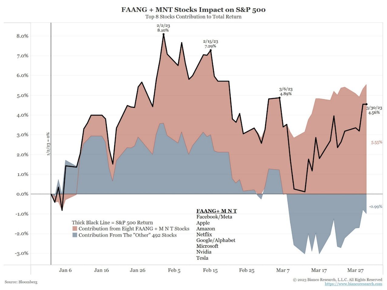
Lest you think it is just us noticing this phenomenon, here is a great chart from Jim Bianco, showing that a handful of companies have accounted for the entirety of the positive performance of the S&P 500 this year:
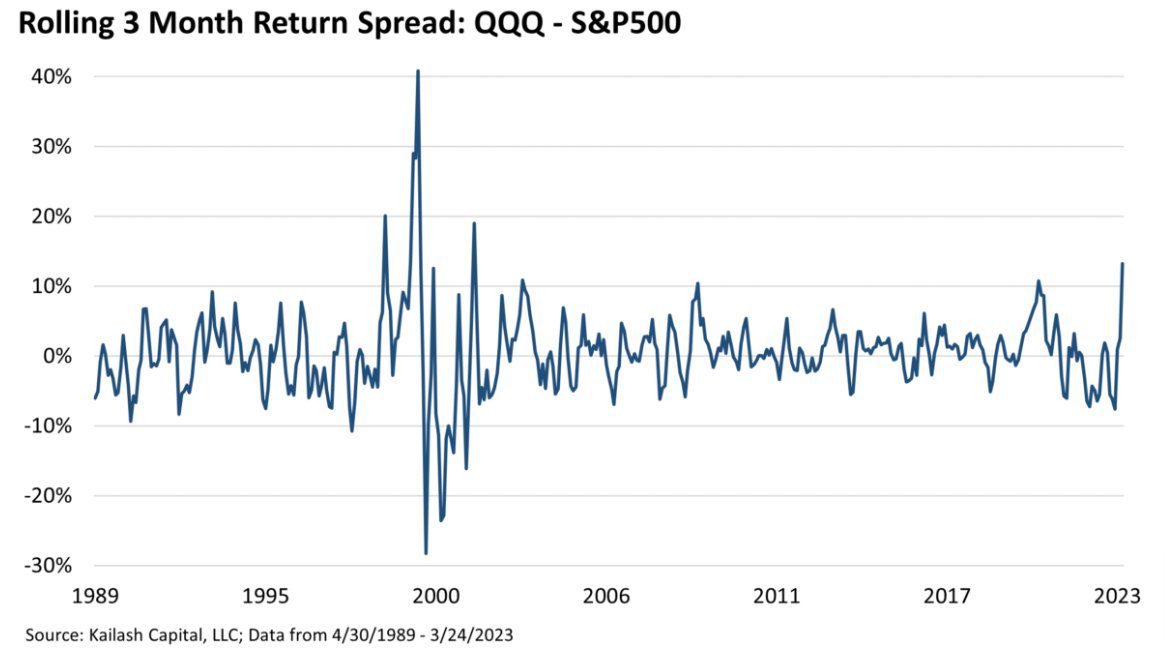
On a year-to-date basis, the outperformance of the NASDAQ versus the S&P 500 is at tech bubble levels according to Kailash Concepts, an outstanding research firm:
Source: Bloomberg (as of most recent month end)
So, the question most of you should be asking is, “why”? Why did investors flock to the largest stocks in the index despite exorbitant valuations?
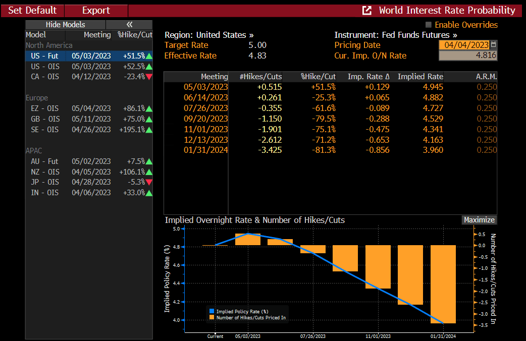
The answer? It worked last time the Fed cut rates and, based on the fallout from the failure of Silicon Valley Bank (SVB), many first-order “thinkers” believe the Fed is going to pivot, i.e., stop hiking rates and almost immediately start cutting them. The sharp drop on the right of the chart coincides with the failure of SVB, and the jump in the aforementioned megacap stocks:
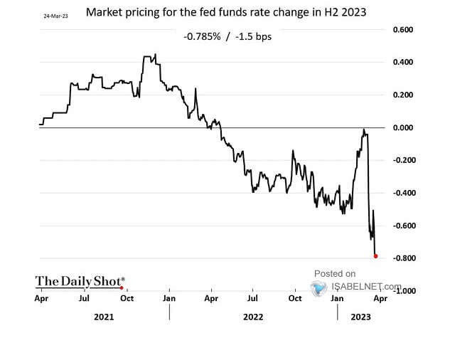
Investors are at a coin flip for a rate hike in May, lower odds for a June hike, then cuts starting in July.
April Outlook – The history book on the shelf, is always repeating itself.
ABBA said it, and we agree.
In this case, the history repeating refers specifically to whether a Fed pivot is actually bullish, or just seems bullish, given the kneejerk reaction by traders, but is an ominous portent. History indicates the latter. According to a study found here, “since 1970, there have been nine instances in which the Fed significantly cut the Fed Funds rate. The average maximum drawdown from the start of each rate reduction period to the market trough was 27.25%.”
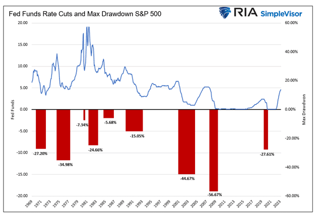
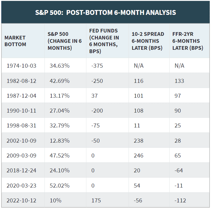
Similarly, 3Fourteen Research shows that prior market bottoms have generally not seen Fed Funds (the rate the Fed sets for banks to lend to each other) higher or a more inverted yield curve after six months.
Is it possible October 12, 2022, marked our nadir this time? Sure.
Is it likely? No.
So, against this backdrop, let’s look at the key factors we track month-over-month:
| More Negative | Neutral | More Positive | |||
| Inflation | ≈ | ||||
| GDP Growth | ≈ | ||||
| Fed Policy | → | ||||
| Interest Rates | ≈ | ||||
| Credit Spreads | ≈ | ||||
| Stock Multiples | ≈ | ||||
| Earnings Growth | ≈ | ||||
| Deteriorating | ← | ||||
| Status Quo | ≈ | ||||
| Improving | → | ||||
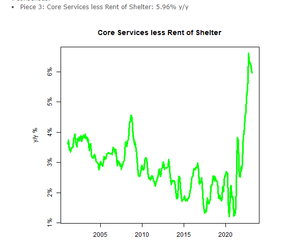
- Inflation – Negative but stable. According to Mike Ashton (aka The Inflation Guy), the February CPI data was not helpful; he states, “point is, this is a bad print for a Fed hoping for an all-clear hint.” Core CPI has actually been increasing since November and was 0.45% in February. Additionally, core services excluding rent are not slowing rapidly enough to give the Fed confidence in inflation being contained.
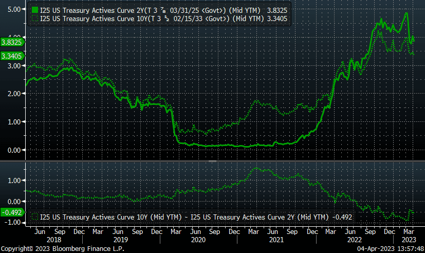
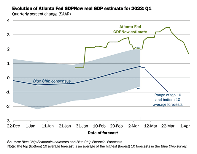
- GDP Growth – Negative but stable. The inversion of the 10-2 curve exceeded 100 basis points at one point in March, before the two-year yield cratered post-SVB. However, an inverted yield curve is a problem; the only thing worse will be if this curve un-inverts due to a collapse in the two-year treasury. The Atlanta Fed’s GDP estimates continue to decline as well:
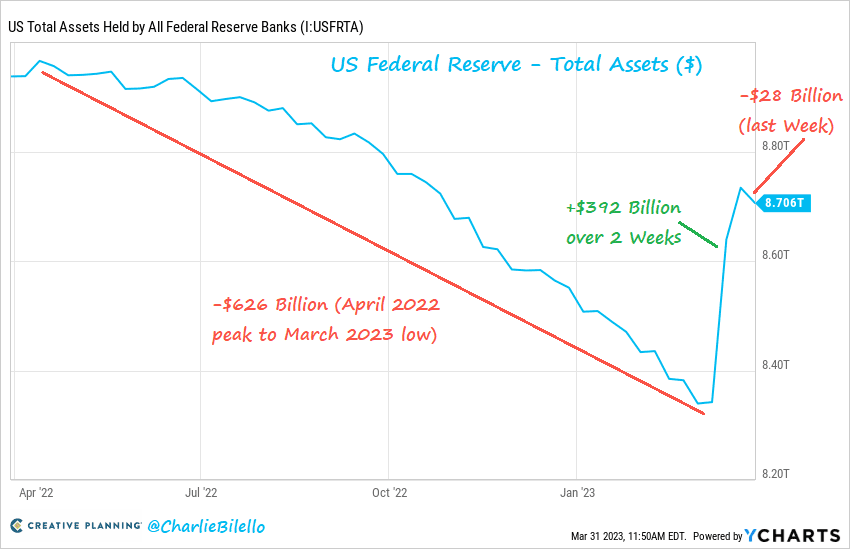
- Fed Policy – Negative but improving. The fallout from SVB has clearly had an effect. As previously mentioned, expectations are now for cuts in the second half of the year. Should this occur, we would view this as a negative. However, the other part of Fed policy is its balance sheet, where six months of balance sheet shrinkage, also called quantitative tightening (QT), was undone in a matter of weeks according to Charlie Bilello. Perhaps this normalizes as fears of a widening bank panic wane, which would compel us to remove the positive bias to this metric.
- Interest rates – Negative but stable. Though the 10-year Treasury fell to 3.3%, tighter lending standards are leading banks to demand a larger spread, which is keeping mortgage rates near 6.5%.
On a somewhat related note, there has been a great deal of digital ink spilled by people who know almost nothing about currencies opining on the death of the dollar as the world’s reserve currency. It is this reserve currency privilege that has, in part, helped keep interest rates low for decades.
While a few marginal deals have been struck, in our view, there are few true competitors at present that could displace the dollar, which is still around 60% of global reserves. China, while an economic powerhouse, would be highly unlikely to cede control over its ability to control the value of the yuan, and there is the whole lack of rule of law/communism thing there. Plus, it is only 3% of reserves. The Euro? Seriously? Bitcoin has been well bid in the wake of the banking crisis, though its volatility, as well as the threat it poses to governmental authorities globally, would seem to make it an unlikely alternative.
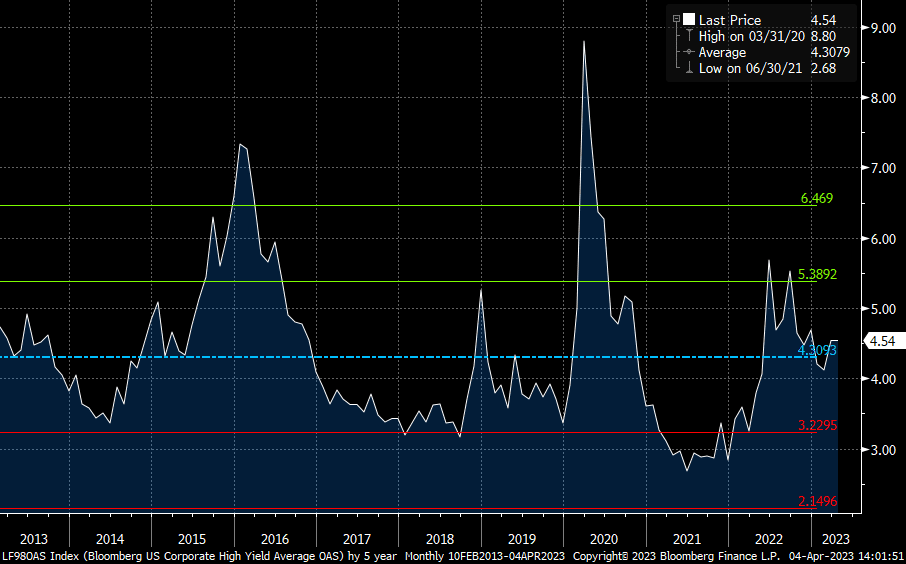
- Credit spreads – Negative but stable. Spreads do not reflect the likelihood of an economic slowdown. High-yield spreads are below their long-term average and have tightened this year. This is a contrarian indicator for us and we would view higher spreads as an opportunity to become more sanguine about the prospects for stronger market returns.
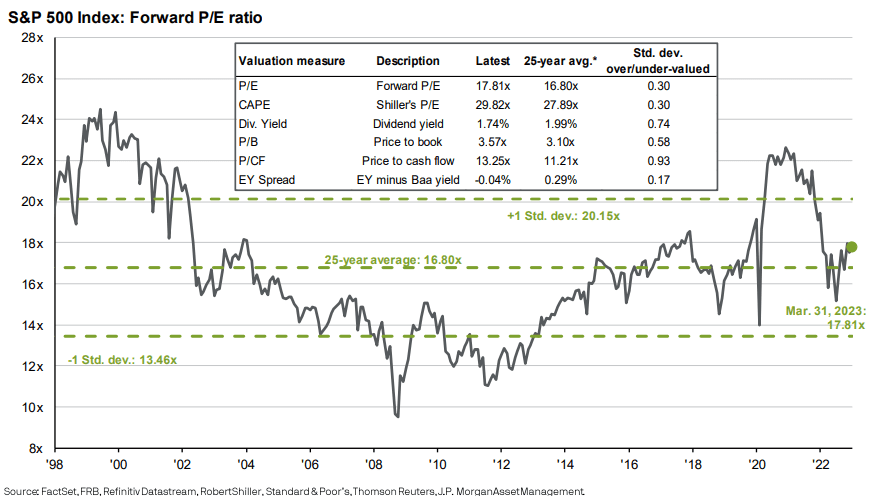
- Stock multiples – Negative but stable. Stocks, as a whole, are slightly expensive on an index basis versus recent history (i.e., the last 25 years) on every metric:
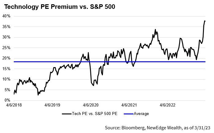
As we have discussed ad nauseum, certain styles/sectors are more expensive, specifically large cap growth and technology, which is more expensive than at its prior post-Covid peak. Large cap growth trades at almost 24x, a 27% premium to its 20-year average:
- Earnings growth – Negative but stable. Earnings were lackluster for Q4. Revenues grew along with inflation, though margins declined. We will address the paradox we see from an earnings perspective in the conclusion, but for now, let’s just say expectations for a mere 1.7% decline in 2023 seem optimistic to us:
S&P 500 INDEX (SPX) – Income Statement
| CY 2018 | CY 2019 | CY 2020 | CY 2021 | |
| 12 Months Ending | 12/31/2018 | 12/31/2019 | 12/31/2020 | 12/31/2021 |
| Income & Expenses per Share | ||||
| Sales | 1,307.81 | 1,364.44 | 1,331.69 | 1,485.67 |
| Growth (YoY) | 9.53 | 4.33 | -2.40 | 11.56 |
| Earnings | 160.26 | 164.35 | 143.41 | 198.69 |
| Growth (YoY) | 24.19 | 2.55 | -12.74 | 38.54 |
| Net Margin % | 12.3% | 12.0% | 10.8% | 13.4% |
| Source: Bloomberg |
Conclusion – The other side of the hill
While the average American probably thinks Duke Ellington defeated Napoleon at Waterloo, it was the Duke of Wellington (not the American composer) along with help from the Prussians. After returning from his first exile, Napoleon went on the offensive and tried to take on two armies at the same time. Obviously, it did not go well.
Jerome Powell’s Fed faces a similar conundrum. On one flank, it faces persistently problematic inflation. On the other hand, its aggressive rate increases have fired a round of grapeshot through the ranks of regional banks, with SVB and Signature dead and several others gravely wounded, jeopardizing financial stability. To us, it seems unlikely the Fed can defeat both enemies at the same time.
Equity investors, especially in the NASDAQ, were briefly exiled to Elba last year as tech stocks entered a bear market. Though possibly apocryphal, Napoleon is rumored to have said, “a leader is a dealer in hope”, and the market’s current leaders are certainly dealers in hope. First, their valuations are stretched to near to prior peaks, when interest rates were near zero, reflecting a massive amount of hope in their earnings prospects. Second, these stocks have rallied based on hopes of a Fed pivot.
It is this latter hope we find the most incongruent with reality.
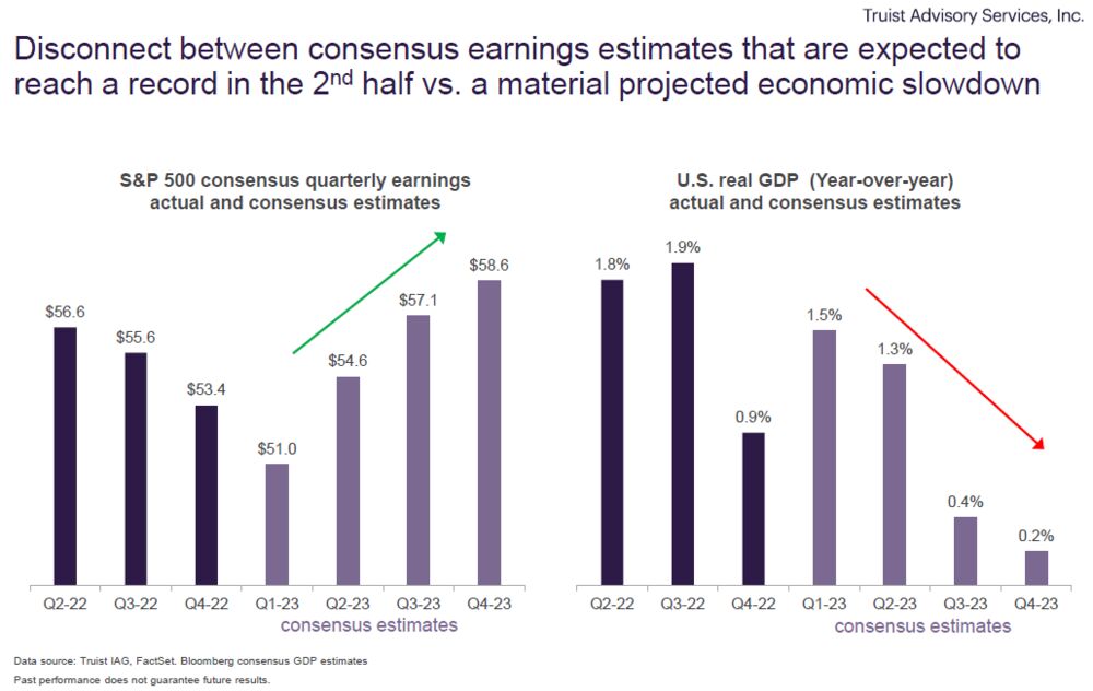
Could the Fed pivot? Absolutely. If banking troubles became more widespread, fixed income markets ceased orderly operations, or the overall economic situation deteriorated because of the delayed effects of prior rate increases, the Fed’s hand could be forced. However, in that situation, it is highly unlikely corporate earnings would fall a mere 1.7%, as currently predicted. This is why we believe investors’ desire for a Fed pivot is so misguided. The following graph from Truist paints a picture of this incongruence, with declining GDP estimates directly at odds with earnings growth, at least historically.
We can appreciate Wellington’s sentiment when he stated, “all the business of war, and indeed all the business of life, is to endeavor to find out what you don’t know by what you do; that’s what I called ‘guessing what was at the other side of the hill’.”
Our analysis can only guess what is at the other side of the hill. We use history, math, logic, strategy, tactics, and discipline, the same tools as a capable general. In this case, we think it is likely that the speculators piling into the NASDAQ at this point are likely to be routed on the other side of the hill, with the survivors exiled all the way to Saint Helena this time. However, we will not know which way the winds of war blow until after the battle. Accordingly, we continue to look for more defensive positions that are well positioned whether we get a pivot (hard landing), no pivot (soft or no landing), or an artillery barrage (crisis). This strategy worked for Wellington at Waterloo, and we think it can position our investors for success, too.
READY TO TALK?